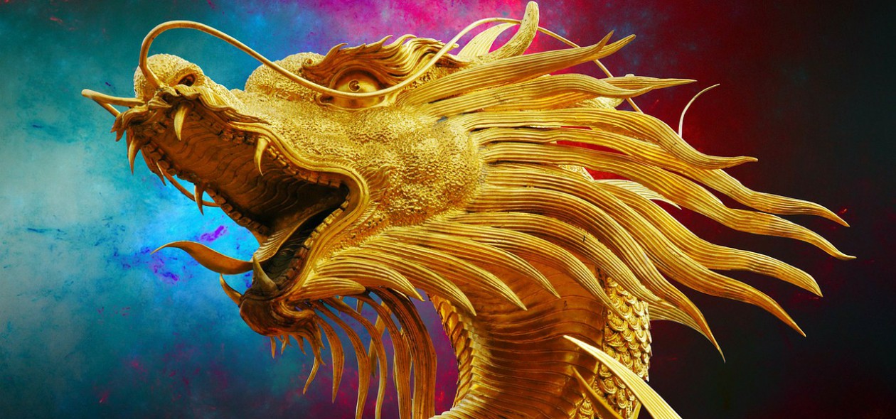
Having recently read a post about the importance of a logo, I created the one above. It wasn’t an easy thing to do as I had to try to get one the didn’t say ‘Fantasy’ or ‘Historical’ to the exclusion of the other, since I write in both.
And I’ve made my tag-line more prominent.
I’ve removed the bookshelf from the heading. My books can be seen in the sidebar, so I don’t think it’s necessary to have them there as well. (And they can be bought by clicking the cover, unlike on the heading.)
What do you think? Do you like it? Please let me know in the comments.
Discover more from Dragons Rule OK. V.M.Sang (author)
Subscribe to get the latest posts sent to your email.

It’s splendid. I have no idea how you did that.
LikeLiked by 1 person
I used Serif Drawplus. I don’t know if they are still around, but I use their stuff all the time. I simply used one of their vector images and added my name to it. Simples!
LikeLiked by 1 person
Nice!
LikeLiked by 1 person
Thanks, Andrew
LikeLiked by 1 person
You’re welcome.
LikeLiked by 1 person